Project Details
Key Metrics
Technology Stack
Explore the Code
This dashboard is fully open-source. Explore the codebase on GitHub or use DeepWiki's AI to discover implementation details.
Joining the Scottish Tech Army
In early 2020, fresh out of a coding bootcamp and eager to contribute during the pandemic, I signed up as a skilled volunteer with the Scottish Tech Army. The organisation had been set up to mobilise tech talent for public good during the COVID-19 crisis.
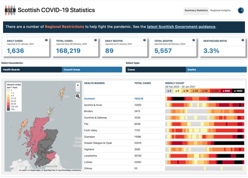
While I was there, STA launched something called the "Homebrew Challenge" in June 2020. The brief was simple: take the Scottish Government's open COVID-19 data and make it accessible to ordinary people. The team had two weeks and had never met each other.
Four teams formed within a day. I joined strangers from across Scotland (and beyond) on video calls during lockdown, figuring out how to collaborate on a real project. Some volunteers were experienced developers; others, like me, were just starting out. The senior team members were generous with their time, teaching pair programming, code review, and how to work in an agile environment.

After the two-week showcase event, the team's prototype was selected as the foundation for production. In only ten weeks since the idea was born, on 2nd September 2020, it launched to the public.
Project Journey
COVID-19 Visualisation Project kickoff. All volunteers given was a link to Scottish Government's open data. Four teams formed within a day.
Four teams present their visualisation approaches to the STA community in the largest group video event to date.
Combined team presents to Scottish Government. Asked to provide feedback regarding their Open Data Initiative.
The Scottish Government release their planned changes to coronavirus data page following the Open Data Initiative feedback.
Dashboard released to the public as an information resource for Scottish citizens. Just 10 weeks from initial challenge to launch.
Scottish Government credit the STA COVID Dashboard in their Open Government Action Plan progress report.
Team Impact & Recognition
The team delivered a vital public resource during the pandemic peak, providing Scottish citizens and public organisations with accessible, understandable COVID-19 data.
World-First Sonification
World-first COVID data sonification, also featured in The Guardian. Led by Dr Eirini Kominou, the team was inspired by the Financial Times' sonification of the US treasury yield curve, adapting frontend sonification techniques to turn COVID-19 time series into sound.
Contributing to the Team
Working alongside other volunteers, I contributed to the core React structure. My work spanned the entire front-end stack, from implementing React hooks and routing logic to designing reusable UI components that became the foundation of the project's visual identity.
Learning About Data Resilience
The primary technical challenge was data volatility. The project relied on daily CSV datasets from Public Health Scotland (PHS), which were processed via an AWS Lambda pipeline. Working alongside a senior mentor and other volunteers, I learned first-hand how to build React components that could gracefully handle changing data formats.
This experience taught me how to write defensive code and design responsive layouts that maintained accessibility across mobile, tablet, and desktop viewports, ensuring that critical summary statistics were the first thing users saw regardless of their device.
const testAllData = {
  regions: {
    S12000013: {
      weeklyCases: 50,
      weeklyDeaths: 0,
      name: "Na h-Eileanan Siar",
      dailyCases: { date: TOTALS_DATE, value: 4 },
      dailyDeaths: { date: TOTALS_DATE, value: 0 },
      cumulativeCases: { date: TOTALS_DATE, value: 167 },
      cumulativeDeaths: { date: TOTALS_DATE, value: 1 },
      fatalityCaseRatio: "0.6%",
      population: 26720.215057246038,
      weeklySeries: { cases: [7, 44, 7], deaths: [0, 0, 0] },
      dailySeries: {
        dailyCases: [0, 1, 3, 1, 0, 0, 2, 1, 0, 9, 15, 2, 13, 4, 2, 5],
        dailyDeaths: [0, 0, 0, 0, 0, 0, 0, 0, 0, 0, 0, 0, 0, 0, 0, 0],
        totalCases: [107, 108, 111, 112, 112, 112, 114, 115, ...],
        totalDeaths: [1, 1, 1, 1, 1, 1, 1, 1, ...],
      },
    },
    S12000049: {
      weeklyCases: 1770,
      weeklyDeaths: 28,
      name: "Glasgow City",
      dailyCases: { date: TOTALS_DATE, value: 282 },
      // ... similar structure for each health board
    },
    S92000003: {
      name: "Scotland",
      weeklyCases: 13311,
      weeklyDeaths: 343,
      // National aggregate data
    },
  },
  dates: [
    Date.parse("2021-01-04"),
    Date.parse("2021-01-05"),
    // ... daily date range
  ],
  weekStartDates: [Date.parse("2021-01-04"), ...],
  startDate: Date.parse("2021-01-04"),
  endDate: Date.parse("2021-01-19"),
};Accessibility-First Design
WCAG 2.0 AA compliance was a team priority. As a newcomer, this project was where I first learned to build with accessibility in mind.
Visually-Hidden Headings
Added visually-hidden headings throughout the application for screen reader navigation, ensuring blind users could navigate the dashboard structure.
Dark Mode First
Implemented dark mode theming throughout the application to support users with light sensitivity, particularly those experiencing migraine or visual strain.
ARIA Attributes
Implemented aria-hidden attributes for decorative elements and fieldset legends for form accessibility.
Responsive Layouts
Created responsive layout styles ensuring critical summary statistics were visible first on all devices, from mobile to desktop.
UX/UI Contributions
From June 2020 to March 2021, I contributed to components and styling alongside experienced volunteers. Every task was a learning opportunity, shaped by the unique challenges of communicating public health data during a crisis.
DataDefinitions Accordion
What I Built
Designed an accordion component explaining complex data terminology, including the critical distinction between specimen date and reported date.
Why It Mattered
Media headlines were causing confusion about daily case counts. By explaining data methodology in plain language, the feature helped citizens interpret statistics correctly and reduce misinformation.

Navigation, Footer & Page Structure
What I Built
Created the footer component with sitemap navigation and social media links. Also contributed to page layouts including the Overview Dashboard, Regional Insights, and About Us pages.
Why It Mattered
Clear navigation ensured citizens could quickly find their local health board stats. Consistent page structure reduced cognitive load for anxious users.


Looking Back
This project will always hold a special place for me. It was my first real-world development experience after bootcamp, and it shaped how I think about code, collaboration, and purpose-driven work.
More than just a technical learning experience, it was my introduction to the open source community. I learned that contributing to something larger than yourself, alongside people you've never met in person, is one of the most rewarding parts of being a developer. The code review feedback, the pair programming sessions, the shared excitement when something finally worked, all of it taught me that software is fundamentally a team sport.
Looking back, I'm grateful to the senior volunteers who took time to mentor newcomers like me, and to the Scottish Tech Army for creating a space where beginners could contribute meaningfully during extraordinary times.

