
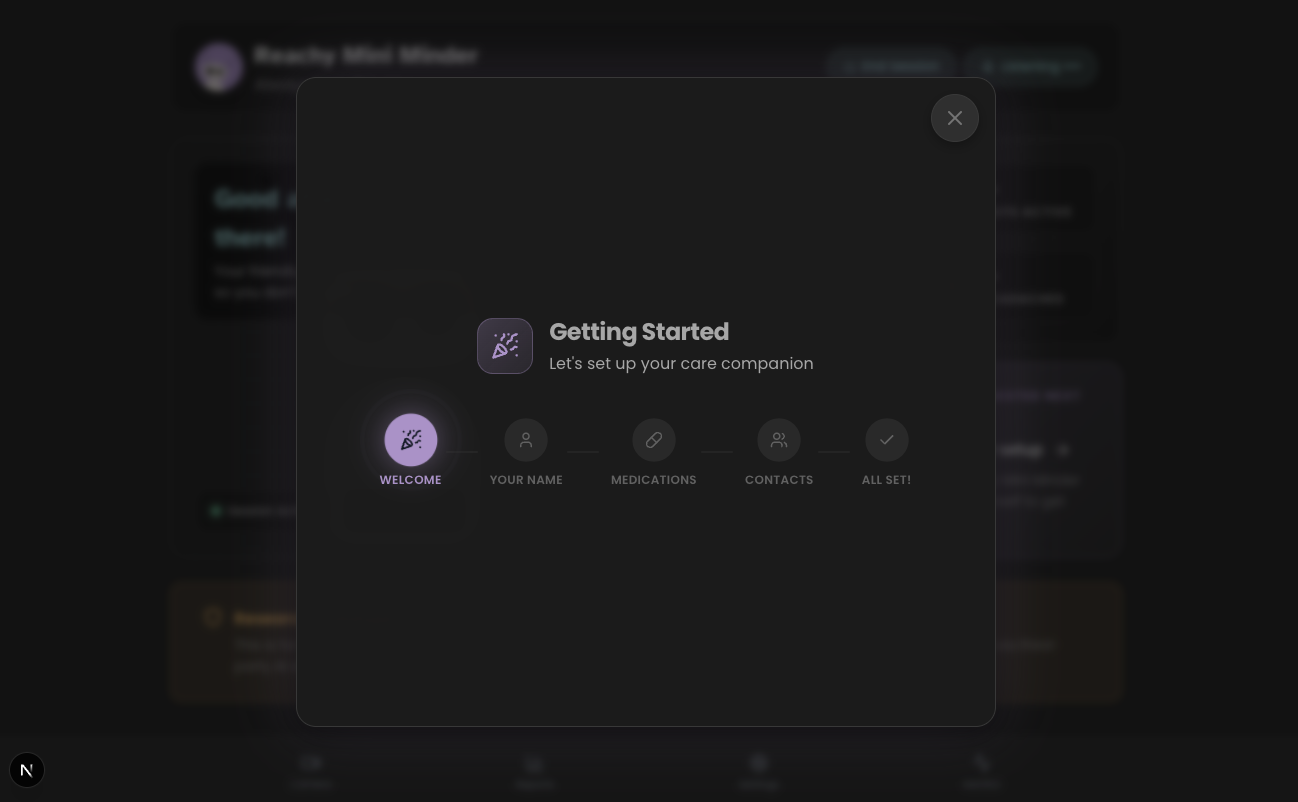
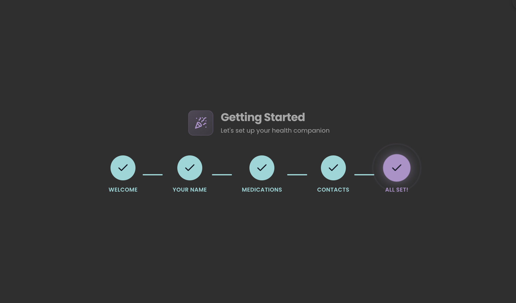
Sprint Details
Component Registry
…plus 18 additional clinical, onboarding, and utility components
Design Philosophy
Pet Parity: Presence over utility. The robot is a companion, not a clinical device.
Voice-First: Critical functions must be accessible without looking at a screen.
Total Occlusion: 100% opaque overlays to eliminate visual vibration.
Accessibility Standard
80-90% of CADASIL migraines include visual aura. Screens become painful barriers. Every primary interaction in Reachy Mini Minder is designed to work without visual input.
Explore the Code
This project is fully open-source. Explore the codebase on GitHub or use DeepWiki's AI to discover implementation details.
Related Case Studies
When Screens Become Barriers
For someone experiencing a migraine with visual aura, a bright screen is a source of pain. Traditional tablet apps expect users to navigate menus, tap buttons, and read text. But what happens when looking at a screen is the thing you're trying to avoid?
This is the core design challenge for Reachy Mini Minder. I needed to build an interface that adapts to the user's current state. The screen is always there, but it's never required. Voice and physical presence handle everything.
Generative UI: The Concept
Generative UI is a pattern where the AI agent selects and renders UI components as part of its response. Instead of returning text alone, the LLM picks from a registry of pre-built React components and pushes the right one into the conversation stream with the right data.
To be clear: the AI does not create new interfaces from scratch. Every component is hand-built. The "generative" part is the selection: the LLM decides which screen to show based on what the user said, and when.
For a voice-first care companion, that selection is the hard problem. Consider the scenario from the opening: a user mid-migraine says "I have a headache." The robot:
Zero taps. Zero navigation. The user never opens their eyes. A regular voice assistant gives you a text response. GenUI gives you a structured medical record rendered visually for later review, built entirely through natural conversation.
The same pattern scales to simpler interactions. "Play some music" produces a grid of tappable cards with number badges. Say "number two" or tap the screen. Both work.
A user might say "I took my pills," "meds done," or "yeah I had the morning ones." Mapping that range of free-form speech to the correct clinical component using conditional logic means writing fragile intent-matching code that breaks on every new phrase. The LLM handles it naturally. For a fixed dashboard with known user flows, this would be over-engineering. But Reachy Mini Minder's input is natural speech, and the space of possible requests is wide and unpredictable. That is where this pattern earns its complexity.
Voice → Structured Data
The robot guides the conversation. Fields fill progressively. Zero taps required.
I have a headache...
"I'm sorry to hear that. Where is the pain?"
—
—
—
—
Left temple, about a 6...
"Got it. Any triggers you've noticed?"
6/10
Left temple
—
—
Bright light and stress.
"Does everything look correct?"
6/10
Left temple
Bright light, Stress
Paracetamol taken
User speaks
Fields fill progressively
Complete entry
Illustrative mockup – Progressive GenUI flow showing 3 stages: empty form, partially filled, and complete entry
User Flow – Headache Entry
The complete user journey from symptom to saved record.
Sequence diagram: complete headache entry flow across system actors
Why the UI Still Matters
Reachy Mini Minder is voice-first, but the visual interface still plays an essential role. During a migraine episode, the patient closes their eyes and relies entirely on voice. On good days, the UI opens up a richer set of features:
See What the Robot Sees
The dashboard includes a camera view with D-Pad controls via a 3D flip card, designed to support remote monitoring of the user's environment.
Trend Visualisation
Weekly headache charts and condition snapshots help users and doctors spot patterns that voice-only logs would miss.
Fine-Grained Controls
Adjusting volume or skipping tracks is faster by tap when you're not mid-migraine. The UI adapts to the user's current capacity.
Future: Caregiver View
Clinical reports can already be generated and caregiver contact details are stored in settings. The next step is a dedicated caregiver view with remote check-in, push alerts, and exportable summaries for doctor appointments.
Voice Shortcuts via Visual Labels
A key accessibility pattern I developed is number badge labelling. Each interactive element in a GenUI component displays a simple number (1, 2, 3) next to it. This allows users to trigger actions via voice command:
"Select number two."
This removes the need for users to recite complex titles ("Play 'Ocean Waves Meditation'") which are error-prone for speech recognition. A single digit is robust and fast. Voice shortcut coverage is being expanded across all components as the prototype matures.
The Component Registry
Reachy Mini Minder uses a registry of 23 pre-built React components the AI invokes by name. Here are some of the voice-triggered components. Say the phrase, get the screen:
MedLog
Real-time medication entry with confirmation
"I took my meds"MedStatus
Today's logged vs pending doses
"Did I take my meds?"MyMedsList
Full prescription list
"What are my medications?"HeadacheLog
Streaming intake with real-time field updates
"I have a headache"HistoryTimeline
Recent entries timeline
"Show my history"TrendChart
7-day headache visualisation
"Show my week"ReportPreview
Clinical report preview
"Send a report"MusicPicker
Grid of selectable music tracks
"Play music"VolumeControl
Animated slider with hardware sync
"Turn it up"…plus 14 additional onboarding, session, and utility components the AI agent triggers automatically.
Total Occlusion: The Overlay Standard
During user testing, I discovered that semi-transparent overlays (60-75% opacity) were "not any better" for users with cognitive fatigue. Background movement and dashboard layers created "visual vibration" that was disorienting.
The solution is Total Occlusion: when a high-density task like Settings appears, the backdrop becomes 100% opaque using the design system's --color-surface-subtle (#242424). Combined with a subtle backdrop blur and centred positioning, this creates a stable visual field. It eliminates distraction without the harshness of pure black, which matters for OLED screens.
❌ Before
75% opacity overlay, visible dashboard movement, "vibration" effect.
✓ After
100% opaque warm dark grey, soft blur, complete concentration layer.
Honest Reflection
I chose Generative UI deliberately as an experiment. I wanted to test whether AI-selected component routing would hold up in a real clinical context with voice as the primary input.
Some of it adds genuine overhead. The components themselves are designed and built the same way as any traditional UI - that work doesn't change. What GenUI adds is an LLM orchestration layer on top: latency, inference cost, and prompt engineering to route correctly. For predictable screens like the dashboard or settings, that layer adds complexity without proportional benefit.
But here's the counterpoint: the AI agent isn't just routing to screens - it's emitting specific components (HeadacheLog, ConfirmationCard, MedLog) based on conversational context, and populating them with extracted data in real time. The components are pre-built, yes, but the LLM is deciding when to emit them and what data to populate. For a voice-first interface where the user can't tap buttons - where they might be mid-migraine with their eyes closed - this pattern genuinely makes sense. Hardcoding every possible utterance-to-screen mapping would be brittle and unmaintainable.
The takeaway: GenUI earns its place specifically where input is free-form and the correct response is contextual. For Reachy Mini Minder's conversational clinical interactions, it's the right tool. For static dashboard panels, a simpler approach would do the same job faster. The design maturity is in knowing where the boundary sits.
The best UI for cognitive aid is still the one the user doesn't have to navigate. Speak a single sentence, hear a confirmation, close your eyes. The screen is there for moments of clarity - and Generative UI ensures that what appears on it is always the right thing, at the right time, with the right data.
Follow the Journey
This case study is part of an ongoing exploration of accessible robotics. See how I researched the personas that informed these design decisions.